
WFG Brand identity
Concept
Description
The graphic element of the logo draws inspiration from WFG’s design history, paying homage to its early origins. As an interior design and build parent company with four businesses underneath, we wanted the WFG brand to stand out as a unified group. This is why the new identity features a unique graphic element, representing all the companies within the WFG family: Modus, Two, Ambit, and Platfform.
Create a new brand and visual identity for Workplace Futures Group as they rebrand to WFG. As a parent company in interior design and build, overseeing five businesses, WFG seeks a refreshed identity that unifies the group.
My Role
Graphic and brand design.
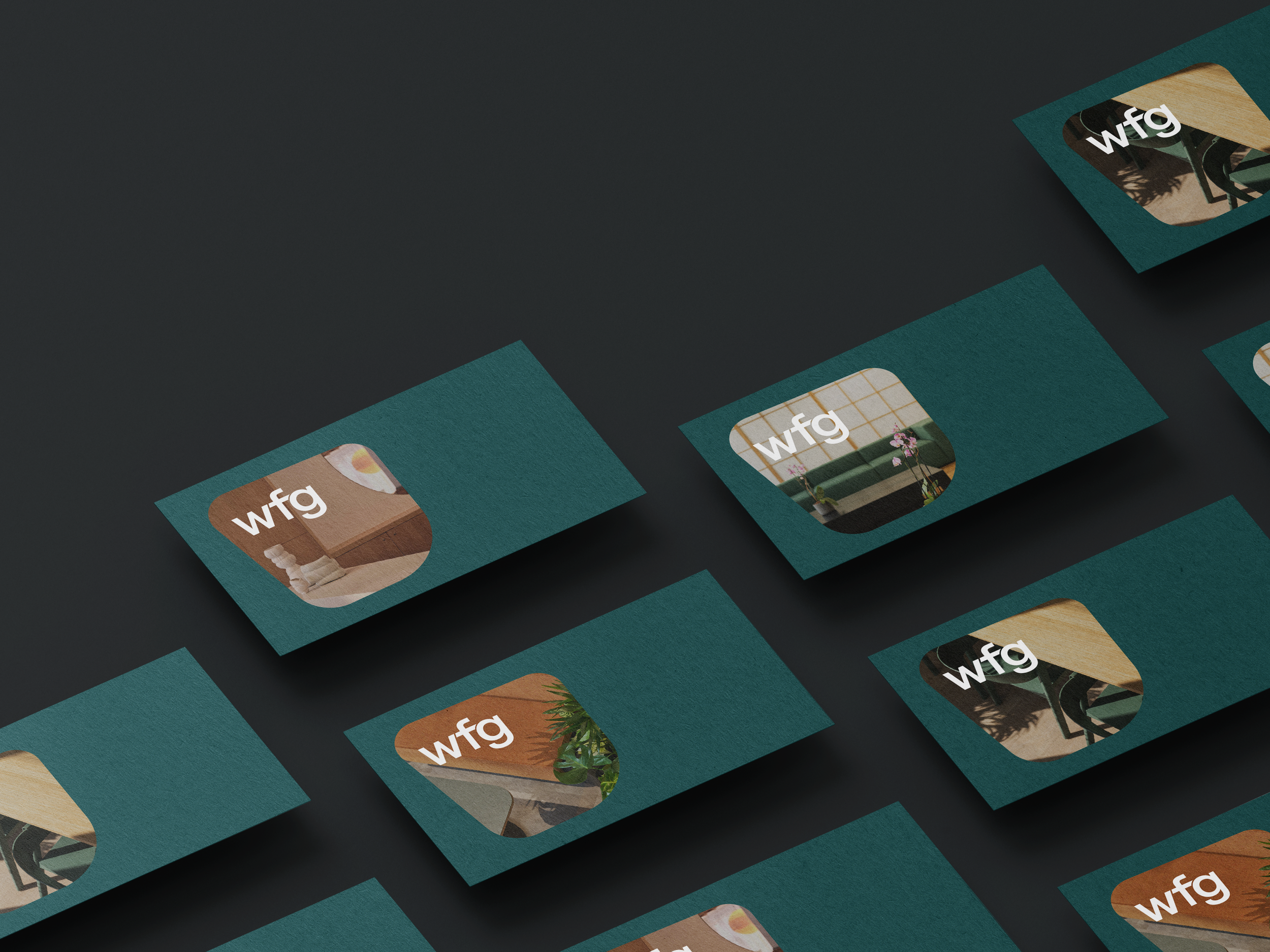
The graphic logo is distinctive and recognisable, whether used alone or alongside text, ensuring versatility across all platforms. A particularly effective application of the graphic shape is as a window into the creative designs and spaces WFG has brought to life, showcasing the exceptional workspaces the company has created. It strikes a balance between sleek, contemporary design and a strong brand asset that reflects WFG’s inspiring environments.


I developed a refreshed brand colour palette, updating to a luxurious forest green as the main brand colour, with a contrasting mint to give it a contemporary feel. The use of green reflects WFG’s commitment to sustainable and forward-thinking workspaces, which are at the forefront of everything they create.
